db Artmag, Deutsche Bank
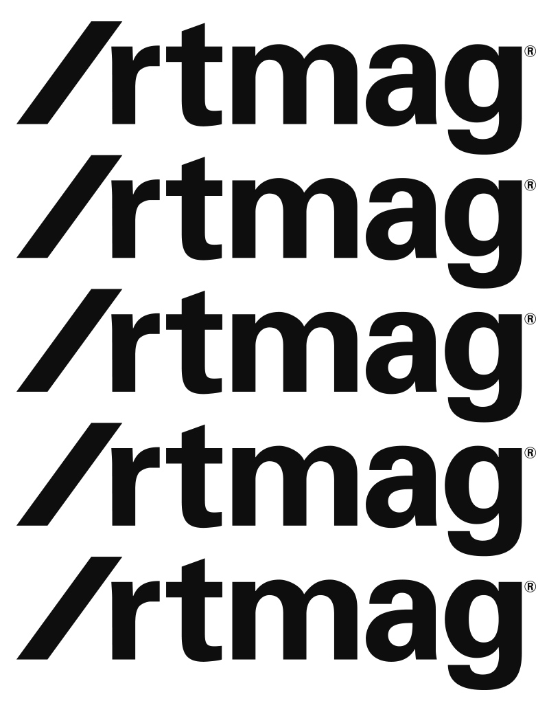
Wordmark design for Deutsche Bank’s online magazine db Artmag.
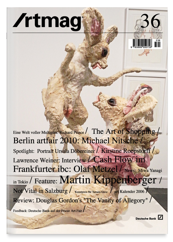
Since May 2004 Deutsche Bank Art’s online magazine is appaearing in new and expanded form: Artmag focuses on the international developments in contemporary art and reports on Deutsche Bank’s art activities and exhibitions worldwide — both from the company collection and in the Deutsche Guggenheim in Berlin. With articles, interviews, news, press excerpts and current dates, Artmag presents the art happening around the bank — on location, in bank buildings worldwide, in museums, galleries and studios.
In order to bridge the gap between the classic print edition and the expanded online service db was looking for a new wordmark and online design.
Stefan’s wordmark proposal incorporates the diagonal of Anton Stankowski’s original logo for Deutsche Bank and db’s corporate typeface Univers. The diagonal of the new wordmark design is a clear reference to Deutsche Bank but also works as a hint to the ‘new’ media it is connecting the art world with its audience — the internet. The diagonal can be read as a ‘slash’ defining the capital ‘A’ of Artmag: /rtmag
Typeface: Univers
Design: SG
Year: 2006/04
Client: Deutsche Bank Artmag
db-artmag