DU R1–10, Blue Edition
Detroit Underground Records
Releases R02—R07 (2004—07)
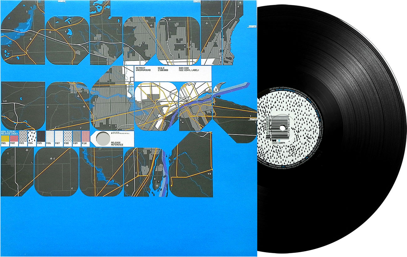
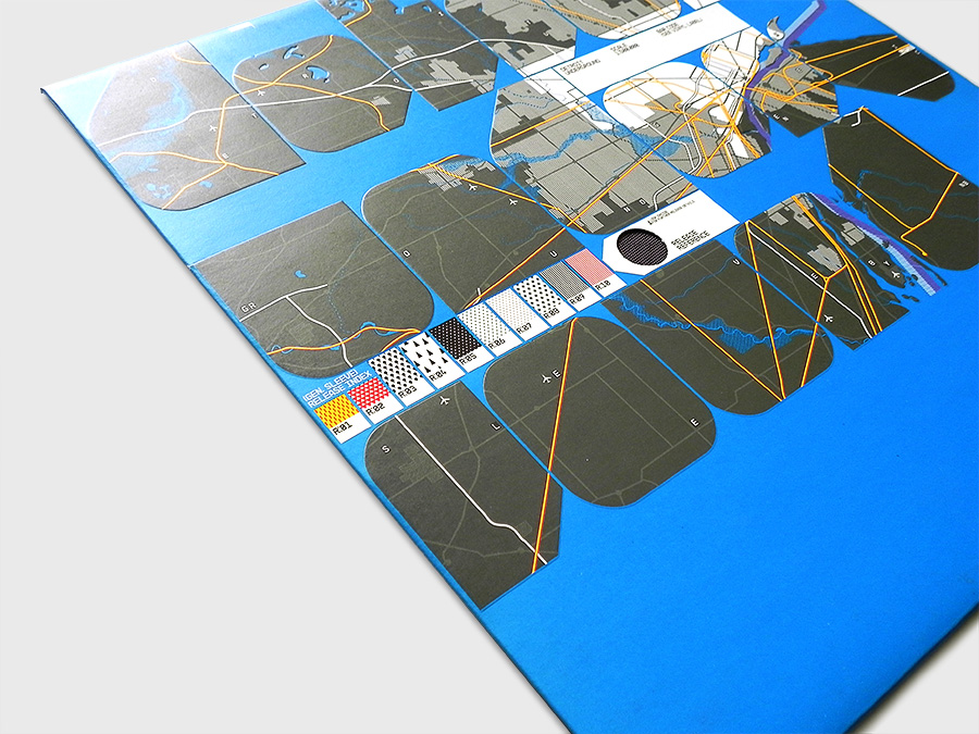
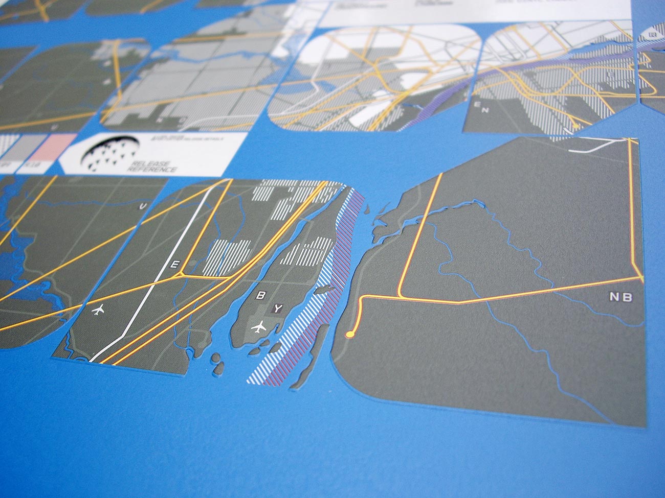
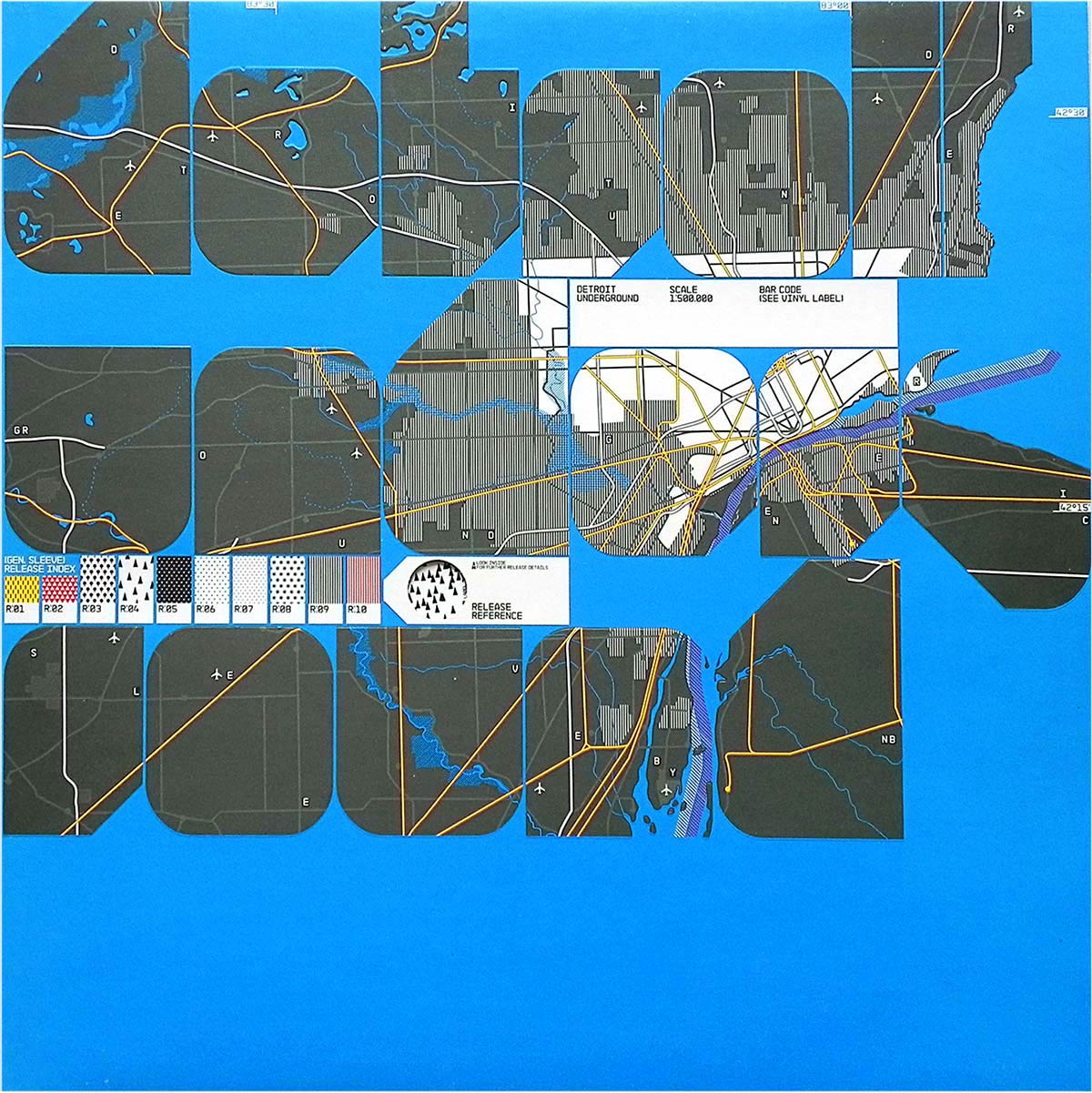
Generic Sleeve Design and Promotional Video for Detroit Underground Record Label’s Release R01 – R07 (also known as ‘the blue edition’). The packaging’s typo-graphic is dominated by Neubaus’ NB-Form™ typeface reading ‘Detroit Underground’ by masking a city map of Detroit (Michigan, USA). Each record release is accompanied and referenced with a graphical pattern which is visible via a dye-cut hole on the front cover showing the record’s circular label sticker. The blue edition also includes debossed type and spot varnish on the cover.
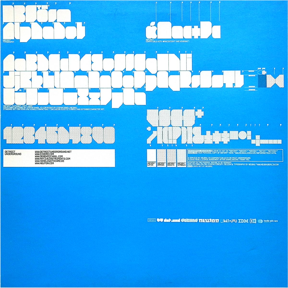
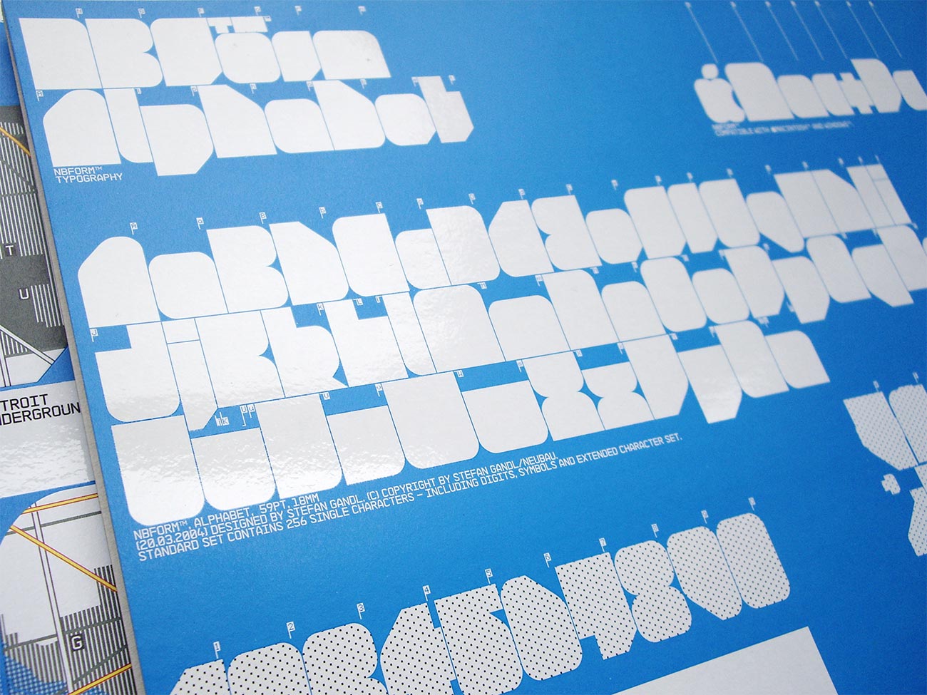
The NB-Form™ alphabet is displayed in detail on the rear side of the cover. A copy of the typeface was also available as free exclusive download to every DU record owner.
The ‘Deformat’ video promoting a track by Kero presented here in its linear edit version was originally an interactive video for vj-events enabling the user to generate an individual motion experience. The visual content is entirely from Neubau’s ‘Neubau Welt Catalogue’ publication. Directed, edited & produced by Gandl/Grünberger in 2005.
Related:
form, The European Design Magazine
Typography: NB-Form™
Concept, Design, Illustration: SG
Year: 2004/03
Client: Detroit Underground
DetUnd