No Futura, First Edition
No Futura, NB-Grotesk™ Edition (2010)
In 1927 Paul Renner released ‘Futura’ — latin for ‘future’ — a geometric sans-serif typeface designed as a contribution to a project known as ‘Neues Frankfurt’. ‘Futura’ is based on geometric shapes that became representative of visual elements of the Bauhaus design style of 1919–33.
NB-Grotesk™ was released on the occasion of the ‘Neubauism’ exhibition held in Eindhoven, the Netherlands, in 2008.
The construction of the typeface is based on Stefan’s diamond grid – a system which is flexible in size, width and dimensions.
One of the rules in creating NB-Grotesk™ was that the term ‘monoline’ is taken virtually and therefore no optical corrections (like thinner horizontal bars) were allowed. The result is a constructed typeface that like ‘Futura’ belongs to the group of monoline geometric sans-serif typefaces.
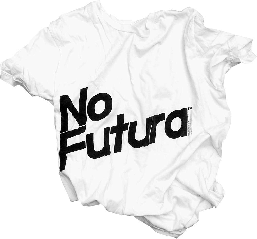
The ‘No Futura’ T-Shirt is branded with an unreleased italic style of NB-Grotesk™ that runs diagonal accross the front.
When on sale the item sold out in a glimpse and became one of Neubau’s most popular and highly sought after T-Shirts.
Print: Silkscreen print by Neubau’s Margarida Castell Branco
Typeface: NB-Grotesk™ Semibold Italic
Design: SG
Related:
No Futura! T-Shirt
No Futura! Print
No Futura, NB-Grotesk™ Edition (2010)
In 1927 Paul Renner released ‘Futura’ — latin for ‘future’ — a geometric sans-serif typeface designed as a contribution to a project known as ‘Neues Frankfurt’. ‘Futura’ is based on geometric shapes that became representative of visual elements of the Bauhaus design style of 1919–33.
NB-Grotesk™ was released on the occasion of the ‘Neubauism’ exhibition held in Eindhoven, the Netherlands, in 2008.
The construction of the typeface is based on Stefan’s diamond grid – a system which is flexible in size, width and dimensions.
One of the rules in creating NB-Grotesk™ was that the term ‘monoline’ is taken virtually and therefore no optical corrections (like thinner horizontal bars) were allowed. The result is a constructed typeface that like ‘Futura’ belongs to the group of monoline geometric sans-serif typefaces.
The ‘No Futura’ T-Shirt is branded with an unreleased italic style of NB-Grotesk™ that runs diagonal accross the front.
When on sale the item sold out in a glimpse and became one of Neubau’s most popular and highly sought after T-Shirts.
Print: Silkscreen print by Neubau’s Margarida Castell Branco
Typeface: NB-Grotesk™ Semibold Italic
Design: SG
Related:
No Futura! T-Shirt
No Futura! Print
Year: 2010/06
Check Availability